DOGGO
An app for dog owners that merges organization, tasks, and navigation all into one place.
Overview
The Problem
Dog owners have difficulty keeping track of their pet’s information and resources efficiently. How can I create an app that solves those issues efficiently?
Tools Used
-
Adobe XD (prototyping)
-
Maze (usability testing)
-
Miro (mind map)


Discovery Phases
In order to gather information about potential users, I sent out a survey to 5 participants.
The criteria I used were for anyone aged between 18 and 70. They also had to be smartphone users, and be a dog owner. *(dog owner is defined as someone who is fully or partially responsible for the care of the dog e.g. vet appointments, grooms, feedings… etc. This does not include the dog owner’s family members that are not solely or financially responsible for their dog e.g. the dog owner’s child)*
The results from the user surveys proved very valuable.
User Surveys


Click on the images for the full view


Empathy Maps
I used the data collected from the user surveys to generate my empathy maps. These gave me a better idea on what exactly my potential users wants and needs were from my app.
Click on the images for the full view
Using the Empathy Maps, I was able to narrow down the information to one persona. This helped my organize the goals and concerns that were most important. To see my goals for the app in a more technical manner, I created the Business Model Canvas which broke down the logistics.
Persona / Business Model Canvas


Click on the images for the full view

Mind Map
To view some of my main ideas, as well as some specific app details in a more creative and abstract way, I generated a mind map using Miro. The process of creating the map put more ideas into the light that I hadn't thought of originally that greatly contributed to my design.
Click on the images for the full view
Prototypes
Low-fidelity
I drew these low-fidelity prototypes using everything from the discovery phases as well as my own implementations for the design.
_Page_1.jpg)
_Page_2.jpg)
_Page_3.jpg)
Prototype 2
Prototype 3
Prototype 1
High-fidelity
Using the low-fidelity prototypes I created these wireframes using AdobeXD which also function as a high-fidelity prototype. The full prototype can be found here.
Click on each photo to see the full view


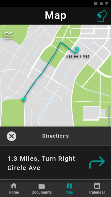


Map
Calendar
Click on each photo gallery to see the full view
Documents
Click on each photo gallery to see the full view
Usability Testing
Equipment
I used Maze, a usability testing website that is compatible with AdobeXD. I found that Maze was the easiest to set up with my AdobeXD prototype, and fairly easy to use as well. I also used PyCharm to calculate the statistics using the data from the Maze usability test.
Location and dates
The test took place the week of Thanksgiving break and spilled into the following week (Nov 21 - Nov 30). Each user was given a link to the test and completed it on their own devices (laptop or smartphone).
Test tasks
For navigation, the user was tasked with signing up, logging in, getting directions to a vet, creating a new file, and creating a new appointment.
For usability, the users were asked about the design of two pages and what the most/least useful of the three main features was.
procedure
The user was sent the link to the usability test which they could complete in their own time. The test began with an intro page explaining what would happen during the test. Then, the list of multiple types of questions were asked. After the user completed all the questions, a thank you screen closed out the test.
Results


Click on each photo gallery to see the full view
Conclusion
What worked well
Based on the data, the features seemed to be very easy to navigate. The users also seemed to like most if not all of the features and their designs. I was easily able to generate some statistics from the data collected using Python since that is the language I have been focusing on most this semester across multiple classes.
What didn't work well
The way I described how to complete the tasks may have been confusing. I should have described to them that the app they were seeing and clicking through was just a prototype and not a fully functional app. I also struggled with creating a good looking graph out of the data. All the data is there, but because of some major outliers, it's a little scrunched up.
Moving forward
In order to move forward, I would like to make some minor improvements and added features to my prototype and turn it into a real app. I would add more features to the map that distinguishes it more from other map apps to make it more valuable. I would also redesign the home page as it adds no value to the app in my personal opinion.